Discovery
Desk research
Insights and
opportunities mapped
isaac is an edtech whose main function is to simplify the lives of sponsors and schools in terms of financial education, so that it can do what it does best: provide quality education to students in Brazil.
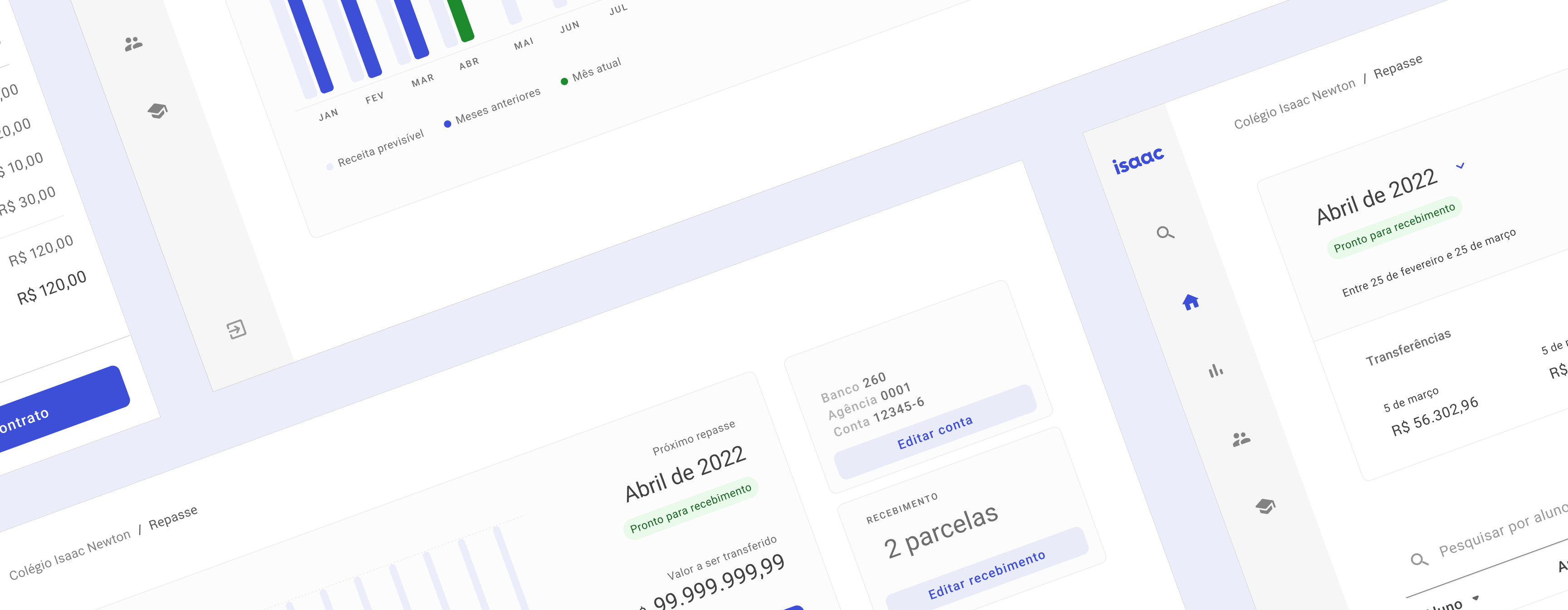
The first existing version of the product, developed prior to my joining the team, can be found below and was developed over a few months and can be classified as the first MVP.
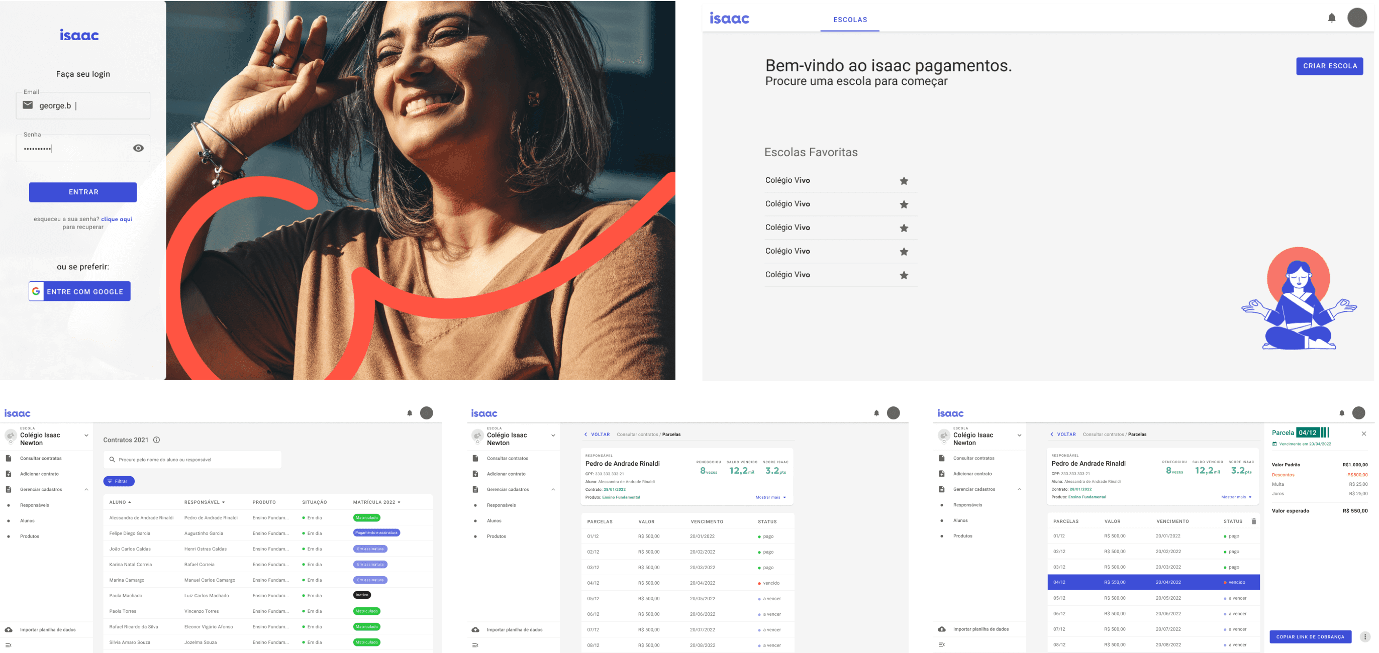
1) The first version of the product was developed with a single view, both for schools and for analysts, which resulted in an excess of information for schools and absence of important features for analysts.
2) Poorly defined value proposition, precisely because it is a single application, with different accesses seeing the same content.
3) The inconsistent visual resulted in visual discrepancies throughout the experience, as well as hampering the project's scalability. Confused and a little bit ugly.
For development, we use Design Thinking and its particularities to help build the product.
In addition to building a new product, we also were building a new team, we designed, in parallel, the design principles that would guide our values, as well as the structure of our process. Everything from scratch.

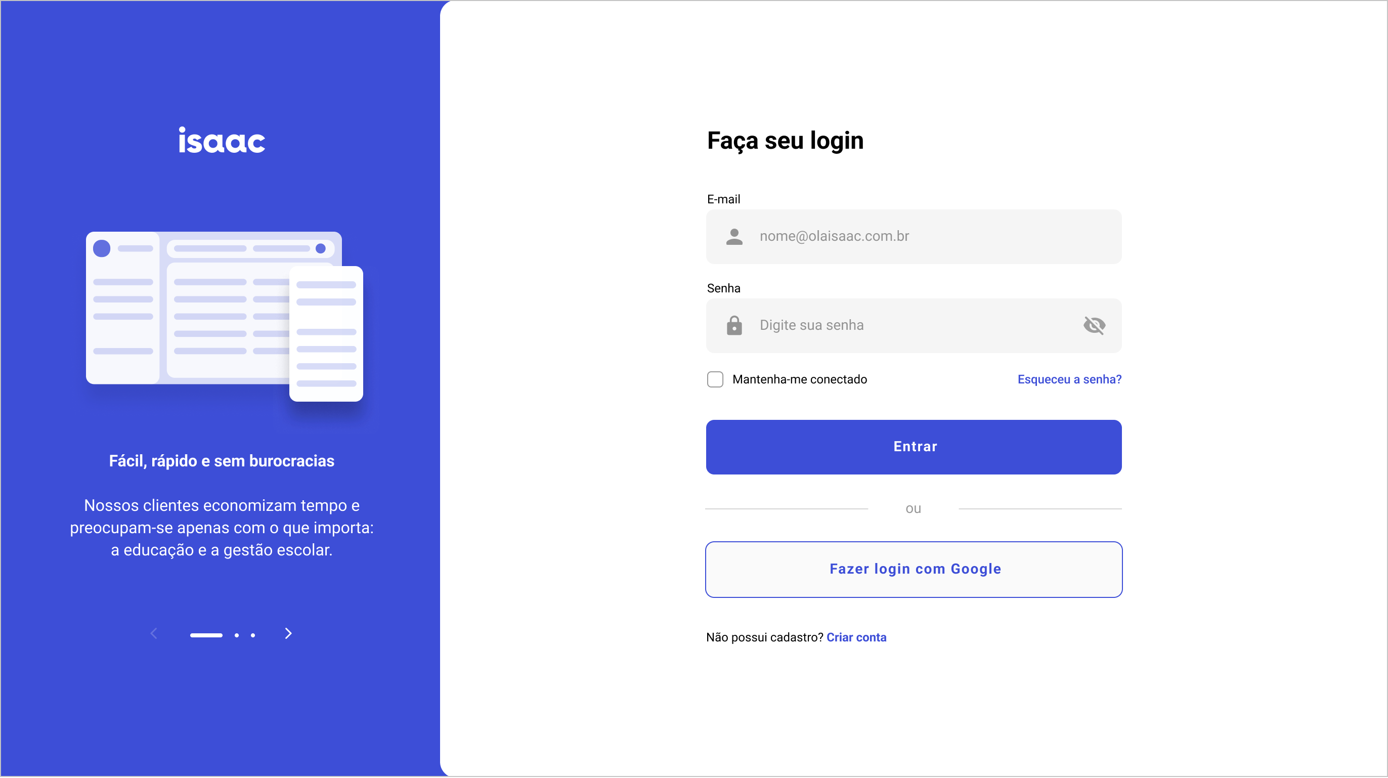
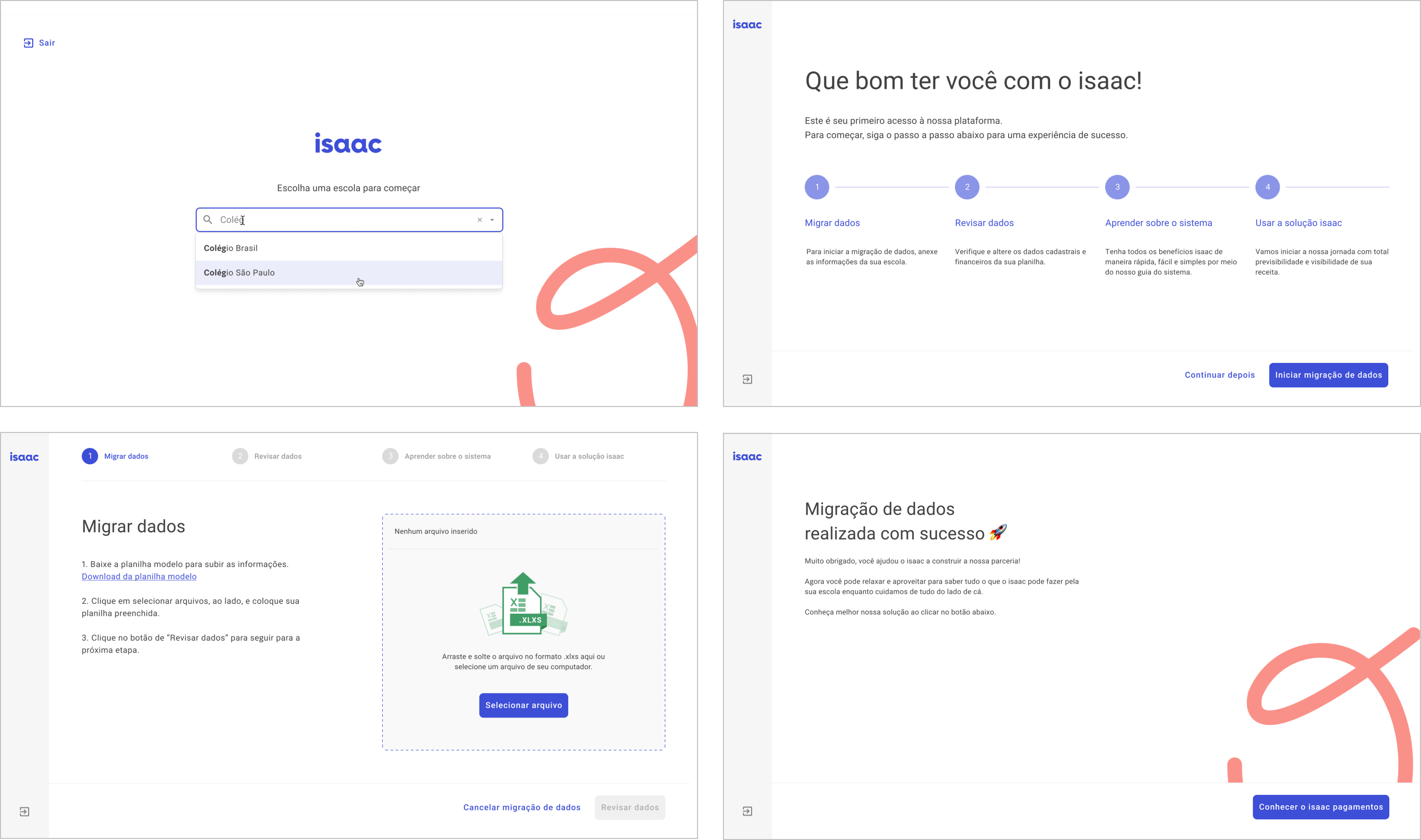
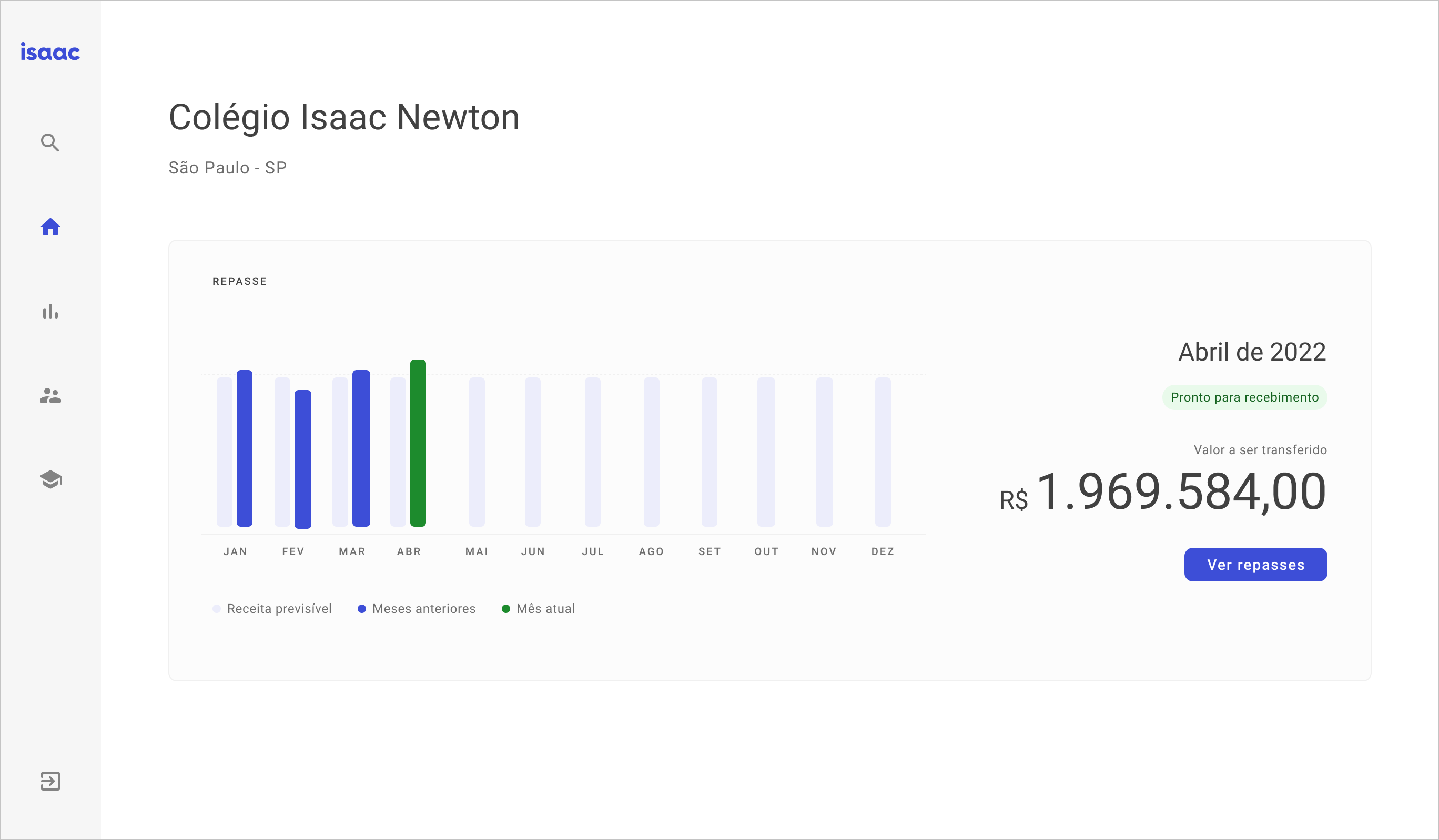
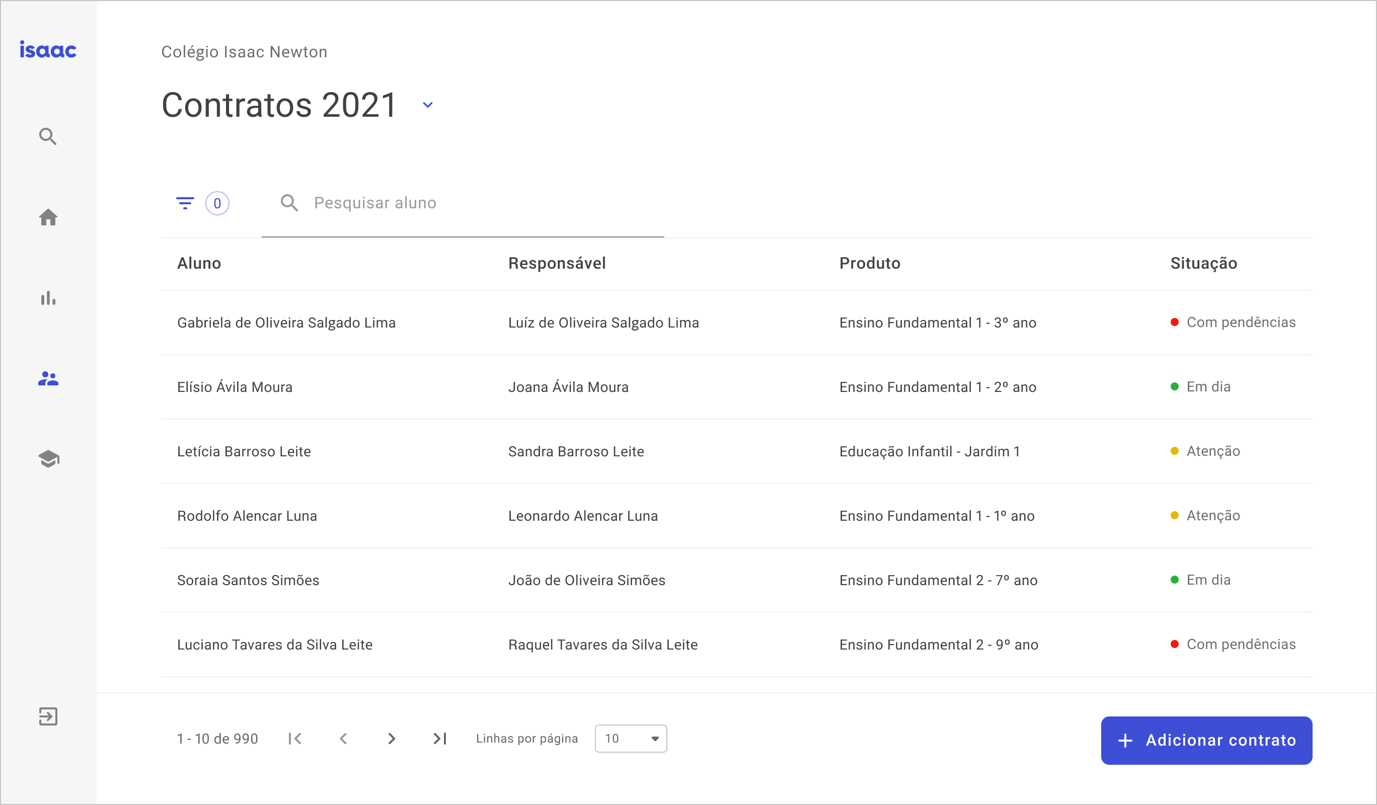
After many processes, all in a very cyclical way, the results began to appear in the form of a much more elaborate, consistent and purpose-built product, solving the main pain points of the problems listed in the product understanding phase.
1) Different versions for schools <> analysts <> families.
2) Better defined value proposition, with an understanding of the desired market share.
3) Consistent visuals, with a structured Design System and initial studies on accessibility.
For partnerships, business inquiries or just for saying hi, send a "hello there" to hello.thalitatorres@gmail.com or fill this form and I get in touch with you.